Client
Vattenfall
Role
1 of 2 UX Designers
Industry
Utilities · E-commerce
Timeline
2020 · 9 mos
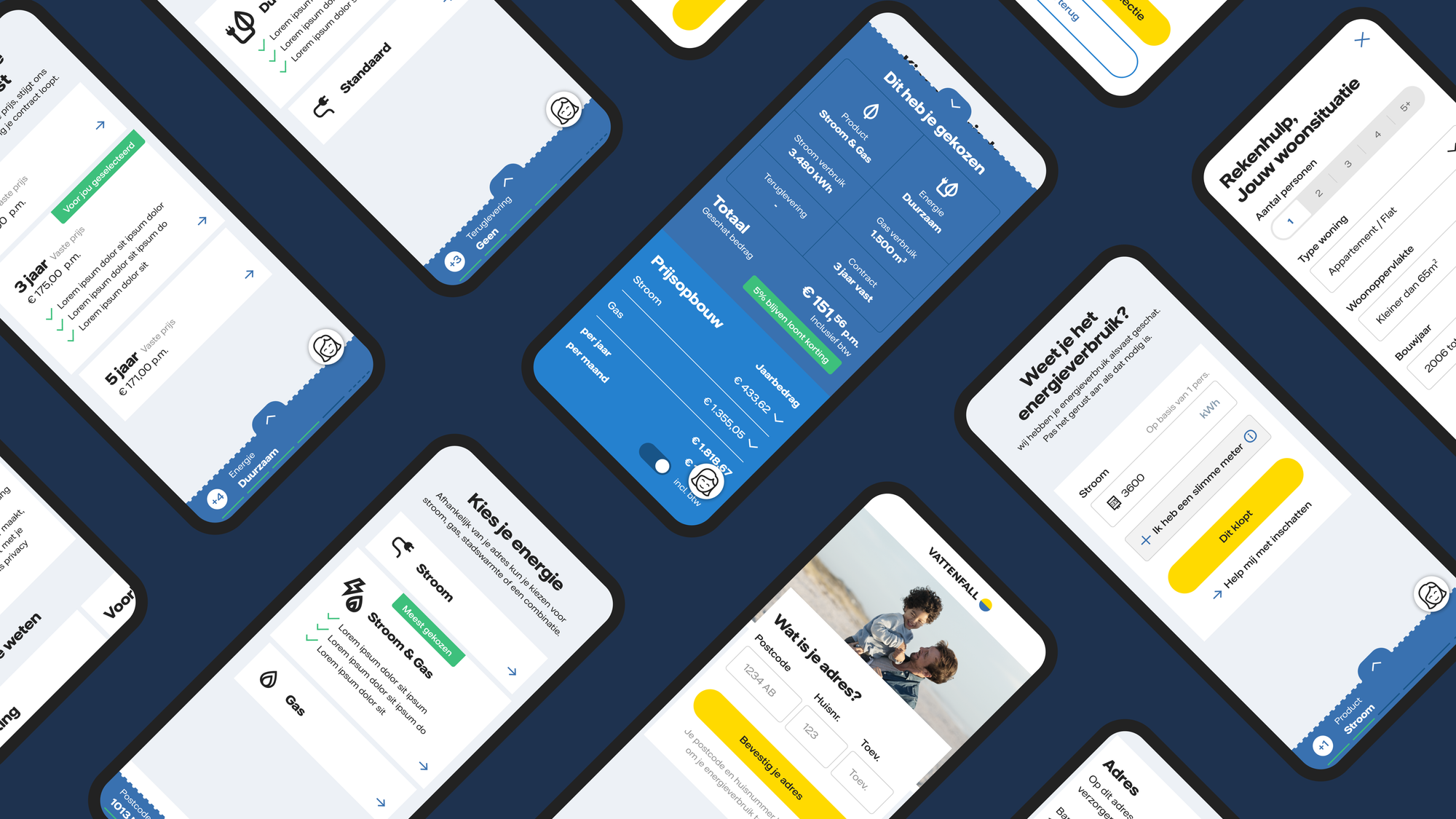
I designed new data-dense features and flows for their main sales channel, focussed on improving conversion, engagement, and usability. The designed user interface meets the different needs of marketing, legal, sales, brand, accessibility, privacy, and technology. As a result, the ease of applying for a new energy contract, alignment between internal teams, and quality of products was increased.
Being 1 of 2 UX Designers
I provided a 60/40 ratio with my companion being 40/60, UX/Visual design. Together we formed the glue in an iterative design process, from analysis to synthesis, designing to prototyping, and preparing documentation for developer handoff. We moved steadily from analysing the under-the-hood Nuon.nl website (the predecessor of Vattenfall.nl) to rapidly prototyping and testing what it could look like in the future.
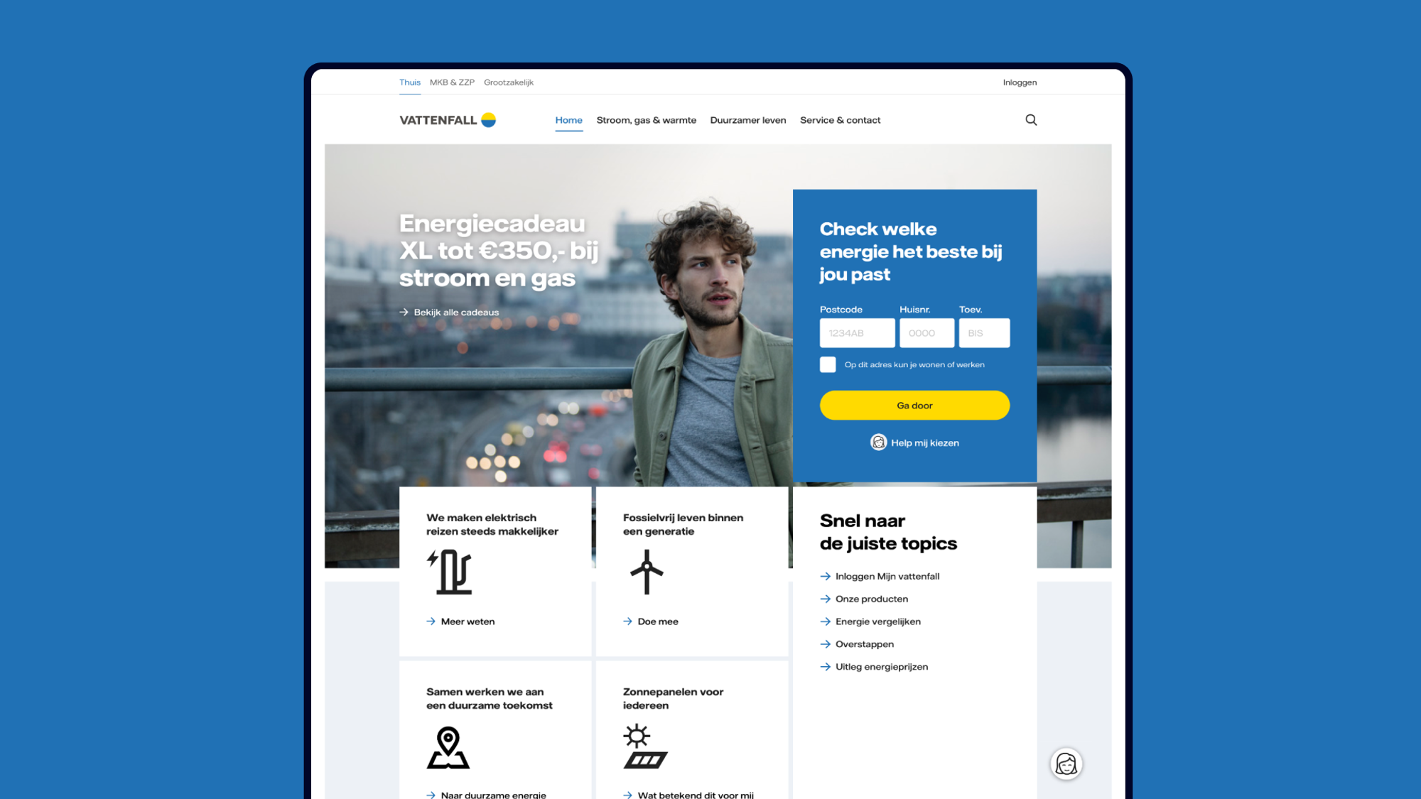
Approaching from the business-side
With a team shifting from 7 to 15 experts, we focussed on improving conversion, engagement, and usability. Data-based decisions were made on how to reduce the number of steps, reduce time spent in the sales funnel and define an overarching framework for interconnected flows and additional products (e.g. district heating, solar panels, and electric charging).
Success metrics
Reduce time spent on tasks
Make workflows work for users to provide focus and save time.
Reduce bounce rate
Remove probability of users leaving the flow for other touchpoints.
Increase product-market fit
Make the sales flow a desirable tool for Vattenfall’s brand mission.
Developing conceptual models
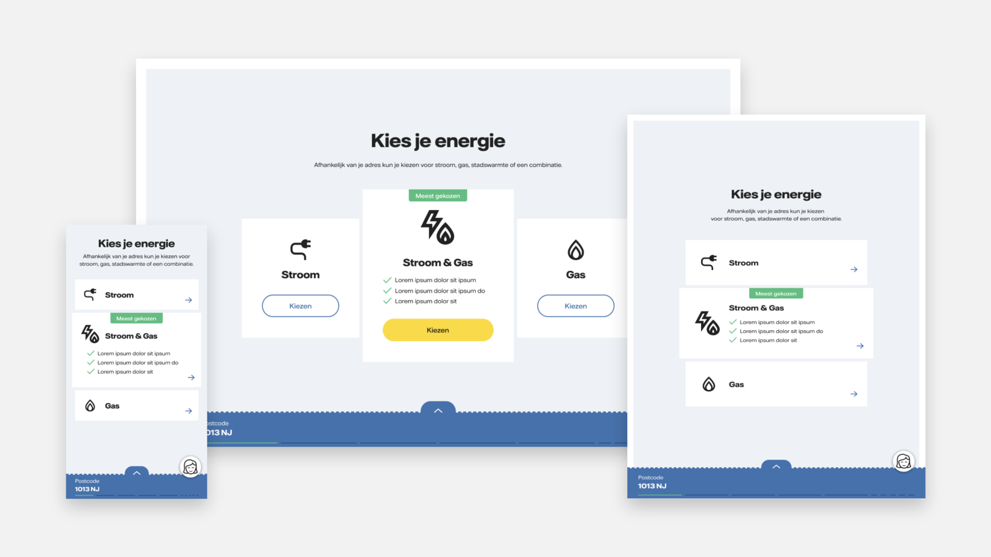
The main principle of interaction design was to maintain a minimal design where focus and tranquility are central and the user is attracted and intrigued by a moment of choice in the form of a group of click/touch-ready tiles placed in the center of the screen. In addition, I helped shape screen-level interaction designs for different flows, tasks, use cases, and details. Based on cookies and location data products are offered. For support we provide information and tooling.
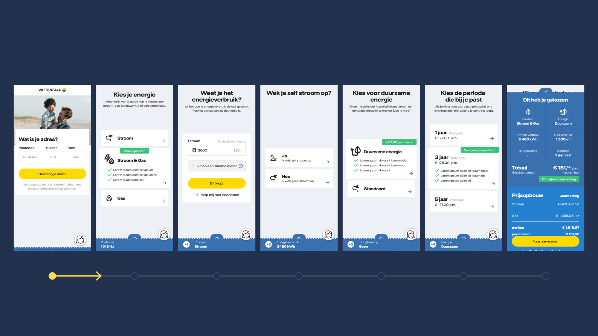
Increasing conversion for sales
Through different iterations of research and testing we ensured value of the new service concept. Firstly, a proof of concept was prototyped in Figma for early user testing with a hand full of people through a indirect network of participants. Secondly, proposed design patterns and mechanisms connecting to the back-end were developed for automation testing parallel to business analysis. Thirdly, a live beta version of the existing product provided opportunities for A/B testing and continuous development on more detail-level with conversion experts.
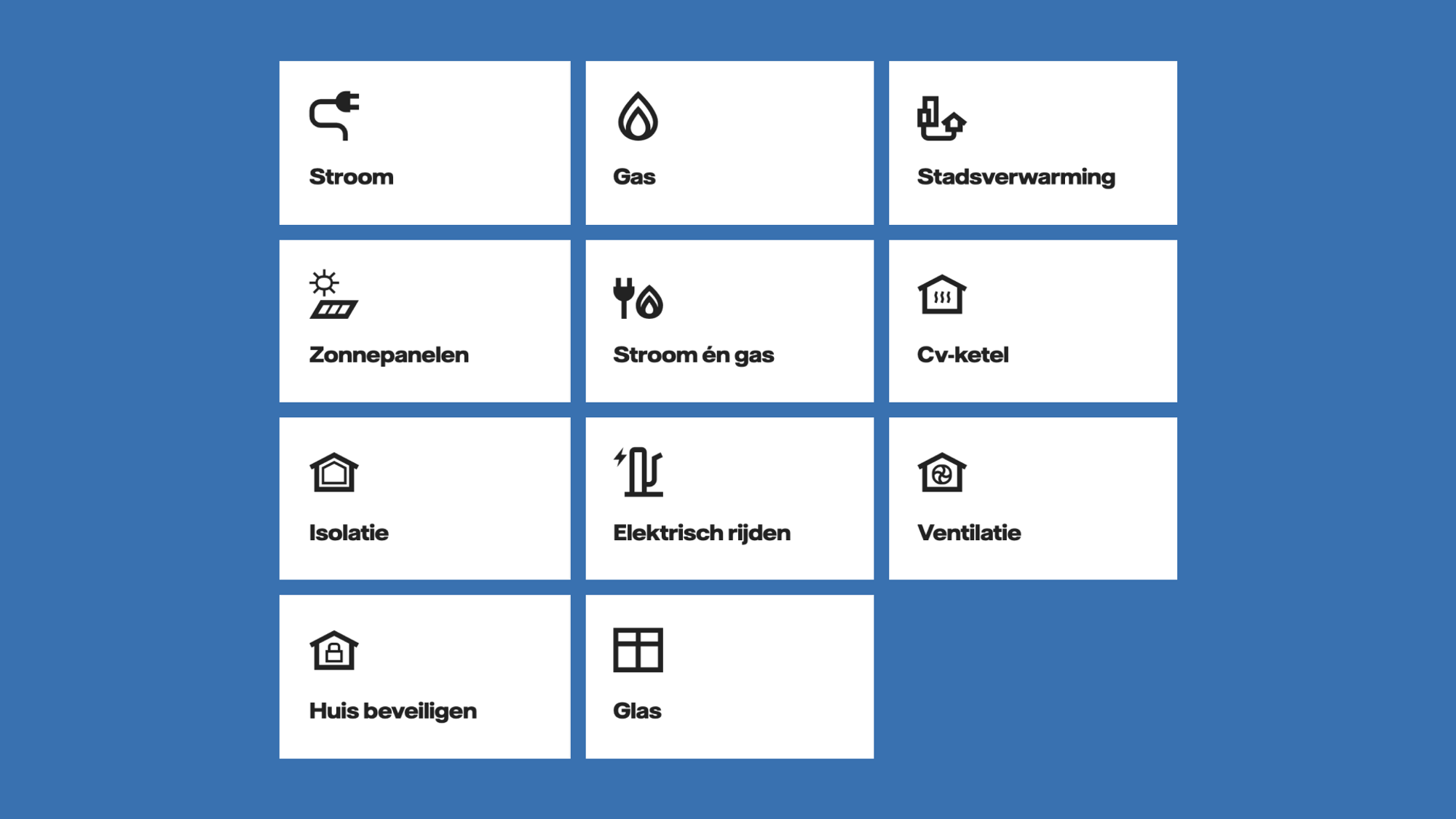
Keeping the holistic view in mind
The renewed sales flow enables Vattenfall to reliably collect and aggregate business-critical data regarding users and their behaviour on their channels. A user interface was designed to meet the different needs of the internal legal, sales, brand, accessibility, privacy, technology, and marketing teams. As a result, other product teams adopted our framework and learnings to continue building on.
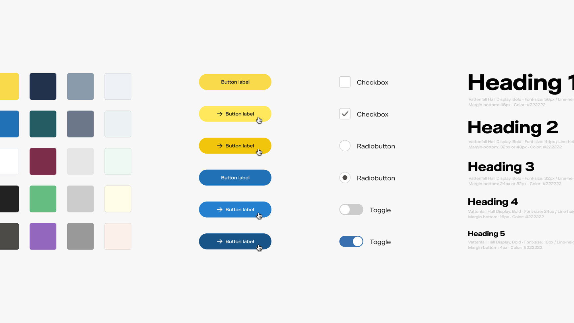
Spearheading the use of Figma
As an external employee, I noticed the sheer quantity of different knowledge storages. From a design perspective only having Sketch, Invision, Zeplin, Abstract, and different brand & media libraries. During their transition to Figma, I formed a group to synthesise knowledge to a shared Figma library (i.e. going from 7 to 2 tools). As a result, we managed to have research, design, and technical documentation in one place for all product teams.
Learnings
What I’ve learned is that having a strong vision for the future is important. However, it’s also critical to set measurable and tangible goals in much closer time (especially in big corporations). The key thing here is to have both. In order to align all the talented teams and individuals with the business strategy, you need both a distant vision that inspires you, and a closer plan that helps you get there.
“Julong has a deep understanding of user-centred design principles and methodologies and is able to apply this knowledge to every project he works on. He has a knack for conducting thorough research to gain a deep understanding of users' needs and pain points and uses this information to inform his design decisions. He also excels in project management, ensuring each project is completed on time and within budget. …” – Bas Wijsman, UX Designer & Brand Lead at Vattenfall
Credits
Remy Lammers – Design Lead • Danielle Hoek – Product Owner • Bas Wijsman – UX/Visual Designer • Sanya Nikulin – Senior Frontend Engineer • Wessel Terpstra – Senior Backend Engineer • Khurram Khan – Senior Backend Engineer • Ehsan Azhar – Backend Engineer • Sander Boetzer – Full-stack Developer • Dirk-Jan Hoekstra – SAP Test Expert • Rob van den Berg – Senior Online Marketeer • Monique Van Dam – Content Manager • Mitchell Faber – CRO Specialist • Jorg Bouman – CRO Specialist • Marlous Been – Digital Analyst.
Next case
Simwave Academy
